I’ve always been a huge fan of the skeuomorphic design of the earlier iPhones, they seemed so quirky, and full of character. I loved all the little details, like how the reflections on the chrome volume slider would react and shimmer, as if light were really reflecting off as you moved the phone around. Or how the notes app had little torn pieces of paper from previous notes. I even loved the Rich Corinthian Leather™ of the calendar app, complete with the fancy stitching, it felt luxurious, especially on the first high-DPI “Retina” displays.
When iOS7 came along back in 2013 it was quite a departure from what we had become used to, with seemingly all of that personality thrown away. Gone was all the depth, texture, and character, and in its place we had super thin text, an endless sea of white backgrounds with no shadows. It felt almost “clinical”. This “flat design” has dominated the industry ever since, and although Apple did walk back some of the more extreme design choices in later software releases, I still missed some of the quirky and whimsy designs we used to see; apps that felt like they became the thing they were imitating.
There’s a great quote I read in a blog post called “The Death of Design” that captures how I feel about what we lost with the move to flat design:
We designed things just to see what they might look like. A calendar app, a music player, a weather app made of chrome and glass. Were they practical? Not always. But they were fun. And expressive. And strangely personal. We shared them on Dribbble, rebounded each other’s shots, iterated, and played.
I remember spending hours on the tiniest details of an interface element no one had asked for. Just… exploring. Pushing pixels for the sake of it.
So when rumours started circling that Apple was going to be redesigning things this year, I was excited to watch last week’s WWDC 2025 Keynote to see what they had been working on, as they unveiled this new design language for all of their operating systems.
“Liquid Glass” as they are calling it, seems to be a step in the right direction, where the user interface is composed of pieces of glass that reflect the world around them, responding to and reacting with light how it would behave in the real world.
As an example, we can see a button here reflecting the yellow of the control above it, as two objects would do in real life:
Liquid Glass also reflects the color of nearby elements. Such an Apple thing to do lol pic.twitter.com/pXV2jK07eT
There are also some really nice playful elements, for example the way folders open and close as you hover over them, and convey their state with subtle clues in their icons, for example when you place files in an empty folder, the icon changes to show that, with a little bouncy animation. Elements feel quite expressive and organic. Liquid is the perfect term for it. It’s taking what we’ve seen from the Dynamic Island on iOS, and applying it to the whole system.
I’ve seen people referring to this new expressive era of design as “Neumorphism” or “Physicality”, and I can highly recommend reading Sebastiaan de With’s excellent blog post on the topic of Physicality, over at the Lux blog.
After watching the Keynote, I do have a couple of concerns. The first one is around text legibility. In some of the examples they gave, the text was quite hard to read, especially with busy scenes where your content is very visible through the glass UI controls. Some apps feel better than others in this regard, so I’m hoping that will improve during the betas.
The second concern is around information density, which still seems to be under attack. Apple is clearly going all-in on “consistency” across all their platforms, but I worry that we end up losing something in the process. For example, on macOS we now have iOS-style alerts which are narrow, and stack all the buttons vertically. This feels like an odd choice for a desktop OS which is used exclusively with big widescreen displays. Why not play to the strengths of each platform?
Overall though, I’m really excited to see how this all ends up coming together, especially when they’ve finished polishing it for release this autumn, and I can’t wait to try it out for myself.
Yes, I know. I’m sure some of you will be thinking this is a bit of a random post, as you double-check your calendars to make sure that it is indeed the year 2025. Don’t worry, I’m not going to start talking about fax machines and record players, but I wanted to share some recent experiences with good old Visual Voicemail.
History
I remember my first mobile phone had voicemail, but the process to listen to your messages was a bit tedious. If someone left you voicemail, the network would send you a text to let you know, along with the number that called. As this didn’t link to your address book, you’d have no idea who it was unless you’d memorised all your friends’ phone numbers, so you’d then have to dial the voicemail service to listen to the actual message.
After navigating through the various menus, the caller’s number would be read out slowly, one… number… at… a… time, and finally you’d get to hear the message itself. After struggling to decipher the low quality recording, and assuming you even recognised the voice of the person, you could then return their call. And that’s assuming the message you wanted to hear was the first one in the list. You may have had to listen to several before you got to the one you wanted. Not really the best experience.
When the original iPhone was revealed back in 2007, one of the features they mentioned for the “Phone” app, was Visual Voicemail, which Steve Jobs described as “Random Access Voicemail”, and it worked more like email than the system we were used to. New voicemails would just show up in the inbox for you to listen to, in whichever order you wanted, and you could easily scrub through the audio, then return the call with a single tap if you liked. It even let you record a custom greeting right there in the “Phone” app. The difference was night and day.
There was only one slight complication – this feature required support from the mobile carriers to work; it wasn’t something that could be done entirely on device. Here in the UK the iPhone launched on the O2 network, so they supported Visual Voicemail from day one, but incredibly there are still some networks that don’t support it, even after the iPhone stopped being exclusive to O2.
SIM hopping
For various years I’ve been hopping between networks to take advantage of the best deals, and there’s one thing that I always, ALWAYS notice, and that’s whether the network supports Visual Voicemail. Every time I try a carrier that doesn’t support it, I think maybe I can live with it, maybe the deal is so good it’s worth the trade-off, but every time I try, I’m wrong.
Issues with signal quality are surprisingly common in the UK, so missing a call on a network without Visual Voicemail feels a bit like being thrown back in time. Dialling a clumsy old voicemail service rather than having my messages magically appear as soon as I get better signal, always leaves me pining for this simple little service from the original iPhone.
And it’s not that I’m some sort of celebrity, dealing with hundreds of calls a day! It’s just that the way we communicate with our friends and family has changed. These days we tend to text more than we call, keeping in touch with our loved ones via group chats and photo sharing. But this means if someone does call when I’m out of service, it’s usually for something important that I don’t want to miss.
Taking it to the next level
Since I’ve recently returned to a network that supports Visual Voicemail, there were some new features introduced back in iOS 17 that I had wanted to take for a spin, and I’ve found them to be really useful.
Live Voicemail
This feature is really handy for screening unknown numbers. The way it works is your phone answers the call, but Siri does the talking, asking the caller to leave a message, as if they had reached voicemail. But as the caller is speaking, their words are transcribed in real-time, so you can see on the lock screen what the call is about. You can even decide to pick up if it’s a call you actually want to take.
Transcriptions
The transcriptions captured from Live Voicemail are saved in the Voicemail tab of the Phone app, but what about regular Visual Voicemail? Well iPhone automatically transcribes those as they are delivered from the network, so you’ll get a transcription no matter which method you use. I’ve found it very useful, and the quality seems pretty good, with only occasional mistakes, which are usually self-explanatory based on the rest of the message.
Getting out of the way
Overall, these features work so well together, they make it a breeze to catch up on any calls I miss when I’m out and about, and are a great example of technology helping to make things easier, rather than getting in the way. For me, that is truly technology at its best.
As an aside, I wonder how many younger people today know that the voicemail icon represents an old reel of audio tape? 3D-printed save icon anyone?
When Apple released macOS 11.0 “Big Sur” back in 2020, one of the changes they made was to increase the gap between icons on the menubar. During development the gap was enormous, but it was eventually toned down for release, based on the negative feedback during testing.
People with a lot of menubar apps found the icons took up too much space, so tools like Bartender became popular to help keep things under control. Later when Apple released the first MacBooks with a notch, people even found their icons disappearing underneath it!
So what can we do about that?
The first thing to do is look to see if any icons can be removed, for example with things like battery life and volume being accessible in Control Centre, maybe you don’t want discrete icons for those? You can quickly remove them by holding Command (⌘) and then dragging the icons off the menubar.
Mind the gap
Once you’ve removed any unnecessary icons, you can modify some hidden macOS settings to reduce the gap between each icon, so they don’t take up as much space. Simply open a Terminal window, and run the following commands:
You’ll then need to log out and back in for the changes to take effect.
I found values of 8 and 6 looked best to my eye, but you can experiment with different integer values to find your favourite.
Before and after, it’s subtle but with a busy menubar it can make all the difference. Shout out to iStat Menus for the performance monitoring widgets you see here.
Undo
You can easily restore the default setting at any time with the following commands:
I really like using Siri to get things done when I’m not able to use my phone normally. For example, when cooking I can quickly add things to my shopping list as I’m using them, so I’ll remember to buy more the next time I’m at the supermarket. Or if I’m driving somewhere, I can easily control my music, or reply to a friend to let them know if I’m running late.
When Siri works, it’s brilliant, but there are times it can be incredibly frustrating to use.
On it… still on it…
Every year at WWDC we hear from Apple that Siri can do more and more things entirely on-device without needing the Internet, but in practice it still seems to suffer from connection issues (even when all my other devices are fine). This usually manifests as Siri responding with the phrase:
On it….. still on it….. something went wrong!
As soon as Siri answers any request with “on it…” I know with 100% certainty that the request is going to fail. Even worse, if you immediately ask Siri to do the same thing again, it will then typically succeed! I really wish Siri would just retry the request itself silently, and save me from hearing that dreaded phrase again.
Split personality
I have a couple of HomePod minis (or is it HomePods mini?), one in the living room and one in the kitchen. When cooking it’s handy to set various timers, so obviously I ask Siri to do that, but if I go into the living room, and ask Siri to check on the status of the timer, it acts like it has no idea what I’m talking about.
Me: “Siri, how long’s left on the timer?” Siri: “There are no timers on HomePod.” Me: *sigh* “Siri, how long’s left on the kitchen timer?” Siri: “There are no timers on HomePod.” Me: *SIGH* *walks to Kitchen* “Siri, how long’s left on the timer?” Siri: “There’s a timer with 4 minutes left.” Me: (╯°□°)╯︵ ┻━┻
I found something on the web
I’ve also had interactions where Siri gives me an example of some phrases I can use, only for it to turn around and say it has no idea what I’m talking about when I try to use them. Or it just abandons any attempt at understanding you and does a web search for what you asked. This usually isn’t very helpful, and it’s completely pointless on HomePod, given it lacks a display. Siri will chastise you in that case, and tell you to “ask again from your iPhone”.
When it comes to memory, sometimes it will forget what you were talking about mere seconds earlier, forcing you to repeat your request in full, trying to get the syntax correct. It’s like typing into a command line, rather than having a conversation.
By comparison, when this does work it feels so much more natural. Asking about the weather, then following that up with “and what about tomorrow?” flows quite nicely. It can also be quite clever, for example, if you’re asking about “tomorrow”, but the time is after midnight, it will check if you actually meant today, which is probably what most people would mean in that case.
SiriGPT?
Can an LLM like ChatGPT help here? I’ve seen a few articles this week claiming that’s exactly what Apple is working on for iOS 18, and I think it would make a big difference. ChatGPT is already so far ahead of Siri simply in terms of how natural sounding the conversations with it can be. They can be quite convincingly real.
I think it would substantially improve the experience if Apple could integrate those conversational features into Siri, but they will need to be very careful to handle the fact that LLMs hallucinate a lot, which is to say they can generate output that sounds plausible, but is either factually incorrect or totally unrelated.
Although Apple hasn’t jumped on the current AI bandwagon yet, they’ve actually been using machine learning (ML) technology in their products for a while now. They tend to use ML in more subtle ways, such as separating a subject from the background allowing portrait mode to be applied to your photographs, or in real-time during video calls. It also powers the Visual Look Up feature that helps you identify people, animals, plants, and more. There are tons of little features like that throughout Apple’s operating systems that rely on ML behind the scenes.
The good news is Apple’s privacy focus, and the presence of the Neural Engine in all their CPUs, means they are able to run a lot of the ML models entirely on-device. I’d expect no less from a next-generation Siri, and for a smart assistant with so much access to your personal data, this can only be a good thing.
I recently started a new job, and one of the upsides is that my computer isn’t locked down into oblivion, so I can actually use a lot of the features that make the Apple ecosystem so great to begin with!
Universal Clipboard now works properly, so setting up things like my HR profile was as easy as copying the image I wanted from my phone, then pasting it on the new Mac. It made the setup process so much faster and smoother.
Reminders sync properly so I can create a “Work” list, and add things to that list as they pop into my head. Or quickly add a personal reminder if something comes up during the work day. The old way involved me sending an email to myself, either at my work address, or my personal address, depending on the subject. Then I’d “process” it the next time I was on whichever device had the relevant mailbox configured. Yeah I know 🙈
I can now make use of separate profiles in Safari, to keep personal stuff and work stuff in their own sandboxes, but if there’s something like a bookmark I need, which is in another profile, I can easily find it without much friction. A useful tip here is that you can configure Safari to always open specific websites in certain profiles. I use that to make sure any YouTube links I click on open in my Personal profile, where I am subscribed to YouTube (who wants to see that many ads?!).
It also allows me to bring my collection of useful apps along with me, without needing to buy them all again every time I change jobs, as well as benefit from any subscriptions I have.
Being able to use my messaging apps again means I’m not stopping throughout the day to get my phone out and respond to friends and family. I can quickly respond on the Mac when needed, and then continue with my work without losing my momentum.
Finally, I can access my music streaming without having to fiddle with my phone. It can be a hassle to switch audio between my Mac for calls and then back to my phone for music, now it’s all in one place and much simpler.
Overall, I used to face all these little points of friction throughout my day, but now they’re gone. It made me think of the old saying:
The whole is greater than the sum of its parts.
Those individual elements aren’t revolutionary on their own, but when they work together smoothly across all my devices like this, it really feels like the technology is serving me, not the other way around.
Apple typically holds an event in Spring, and this year was no exception. Their Spring Loadedevent covered updates to existing products and announced some new ones too.
The environmental report also looked good, with many of the products being made from 100% recycled aluminium, tin and rare earth metals. It’s good to see that Apple includes an environmental report at the end of each product, and is making great progress there.
AirTags
These tiny little tags can help you find your belongings. At just over 3cm in diameter, they’re small enough to drop into a backpack or handbag, though there are also accessories such as keychains and luggage straps you can use.
If you have an iPhone with the U1 chip, you can even get the precise distance and direction to the tag, in addition to the map location.
Interestingly they have a user-replaceable battery, using a standard CR2032 button cell which is expected to last for at least a year before it needs replacing. It would be nice to see more replaceable batteries in other Apple products given ageing batteries affects the longevity of a product.
Crowd Sourcing
A neat feature of the AirTag comes via integration with the existing Find My1 ecosystem. This means any iPhone, iPad or Mac that gets near a lost tag will report the location to iCloud, making it more likely you’ll find your lost items.
In “Lost Mode”, AirTag can be configured to show a custom message, such as your contact details. If a good samaritan finds the tag, they can tap it with an NFC-equipped smartphone to display the message, hopefully helping to reunite you with your belongings.
Using crowd sourcing in this way means that hundreds of millions of Apple devices around the world can work together to help locate a missing tag, like a supercharged Lost and Found. Very cool.
For AirTag, the crowd sourcing works via low power bluetooth, and is relayed back to iCloud anonymously and encrypted so that not even Apple can see the location data. I really like this approach as it means you’re helping other people find their lost items, transparently, and without compromising your own privacy.
Apple have also thought about the potential for these tags to be misused — by dropping one into a stranger’s bag for example. To that end, your iPhone will alert you if an unknown AirTag is nearby, playing a sound after a while, to help you find it.
This obviously doesn’t help if you don’t have an iPhone, but that’s a wider problem for technology like this. I’m not sure how you would solve this for any conceivable phone. What if the person doesn’t have a phone at all?
iMac
The first M1-powered iMac looks like a good solid update. The most striking part is how thin it is. Previous models were incredibly thin at the edges, but were curved like an arch; the new iMac is completely flat, 11.5mm thin throughout.
The seven bright new colours are evocative of the original iMac G3 “flavours”, adding a lot more personality to the range. Colour-matching the aluminium of the keyboard and mouse to the iMac itself is a nice touch.
TouchID in the keyboard is a welcome addition, but I’m not sure why they didn’t include FaceID in the iMac’s upgraded 1080p FaceTime camera, that would be really nice to see.
Otherwise we see the performance bump you’d expect from the M1 chip — 85% faster CPU and 50% faster graphics, and the range of other benefits, from the image signal processor, the neural engine for 3X faster machine learning, unified memory architecture and so on.
A high resolution 4.5K display with True Tone rounds off the new model.
Even though I prefer my Mac laptop for being able to use it anywhere, I find myself really drawn to these new models, I think they just look brilliant.
Cooling
One thing that stood out immediately from the internals is just how much smaller the cooling system is. The previous Intel-powered model required an enormous fan and an exhaust that wouldn’t look out of place on a small hatchback.
The new model has only two small fans either side of the logic board that are barely visible in the profile. This means the new machine is very quiet; Apple claims less than 10 decibels under “typical load”, which is almost imperceptible.
This is something common to all the new Apple Silicon machines; they are so power efficient that they run cool and quiet. It’s a joy compared to the Intel-models which, when working hard, can sound like a jet engine during takeoff.
iPad Pro
Another solid update, this time to the iPad Pro. What stood out to me the most was the inclusion of technology from the $4,999 Pro Display XDR on the larger 12.9” iPad model.
This is the first iPad to feature mini-LED technology, with 10,000 mini LEDs that are 120X smaller than the 72 LEDs used in the previous model. This gives incredible precision over the backlight, and allows for incredibly rich and vibrant colours, sharper details, and darker blacks in dark scenes. It’s amazing to see Apple already shrinking their XDR technology down to the size of an iPad.
Sadly it isn’t available on both iPad Pro models, which I guess is partly due the size requirements, and possibly also to keep the smaller model’s price down, but it does add fragmentation to the product line, which can be frustrating.
It was also a surprise to see that the new iPad Pro uses the M1 chip. Typically the iPads have used a higher performing variant of the A-series chips used in iPhone, with a “Z” suffix. With so many people using the iPad as their main computer, this takes the already impressive capabilities and raises them to a new level.
Apple TV
A nice solid update to the Apple TV 4K hardware adding a more powerful chip, the A12 Bionicwhich first appeared in the iPhone XS. I’m using an older Apple TV HD model myself, which sports the older A8 chip. Though still plenty capable, performance in more demanding apps could be better.
There is also a new Siri Remote, which looks like a great upgrade. It combines the best features of both the Siri Remote and the old aluminium Apple Remote. It has an iPod-esque outer ring for scrubbing through video, but remains touch sensitive for swiping through longer content lists. It also acts as a button for clicking up, down, left or right, allowing for more precise navigation through menus. The addition of dedicated “power” and “mute” buttons is also appreciated.
Many people had criticised the ergonomics of the previous remote. In fact a Swiss TV company wanting to use Apple TV as the “set top box” for its customers, thought the old remote was so bad they developed their own. I think this will be a welcome change for many.
I’m not sure why Apple continue to sell the older Apple TV HD, which is approaching six years old, when the 4K model is only $30 more and can handle HD (1080p) or 4K televisions (and their respective content). In my mind it would make sense for them to unify these into a single model to avoid confusion. They have at least updated this model to come with the new remote.
Finally, another welcome feature is the ability to colour calibrate your television by using the camera on your iPhone. This allows the iPhone to measure the actual performance of your TV, compare it to industry standard specifications, and then make adjustments to the output to try to improve any deficiencies.
Colour calibration can make a huge difference to the picture quality, so it’s great to see it being made super easy for everyone to be able to do.
The Find My network recently gained support for third-party accessories alongside Apple’s first-party devices. ↩︎
I was drawn to the Mac for many years before I finally got my own. This post talks a bit about how I got into the platform.
I’d poked about on display models in computer stores, and was blown away by the way they looked, both hardware and software. In the PC world, Windows XP was the pinnacle of operating system design, but the contrast between that and Mac OS X was stark. The Mac looked so much more inviting — as usual Steve Jobs put it best when he unveiled this new interface, named Aqua:
“We call that new user interface Aqua, because it’s liquid. One of the design goals was when you saw it, you wanted to lick it.”
– Steve Jobs, Mac OS X Introduction, Macworld 2000
In the introduction Steve demoed things we take for granted in computers today. Even simple things, like being able to drag a window around and see the contents smoothly move with it, were difficult back then. Windows couldn’t do that, opting instead to just draw an outline of where the window would end up.
There was just so much more personality. I think one of the adverts that best exemplified the Mac’s personality was this one from 2002, for the iMac G4, one of my favourite Apple adverts:
Apple – iMac G4 “Lamp” ad (2002)
I wanted one immediately. It remains my favourite Mac design to this day. It’s unique, fun, quirky and friendly. The all-in-one design also meant it was more compact than the dull beige/cream boxes that the majority of the industry was building.
The display is one of the most ergonomic Apple has ever made. It could swing 180° left to right, 90° back to front, and tilt 35°, giving you a lot of flexibility.
eMac
Sadly, being a student at the time, I couldn’t afford this new iMac, but around the same time, Apple released the eMac. It featured a design reminiscent of the first-generation iMac G3, but with the familiar white plastic finish of the era, and sporting a large 17″ flat CRT display.
Weighing 23kg and lacking a carrying handle like the iMac, it wasn’t meant to be portable, but it was aimed at the education market, with lower prices to match. I decided to get one.
This was a time before the Apple Store existed, but I found one at a nearby Apple reseller (about an hour’s drive away), picked one up with a student discount and never looked back. Initially I “dipped my feet”, using the Mac as a secondary computer to my Windows PC. Eventually I found myself doing more and more things on it, so I decided to bite the bullet and migrate over.
I think it took me two weeks or so to get used to the Mac as my main computer. Mostly it was minor differences, like keyboard shortcuts, for which you develop a “muscle memory” that took a while to adapt to. Eventually I got used to it and never looked back!
I remember loving finding little bits of “fit and finish” that made things easier in the OS. An example was realising the little icon next to a filename in the titlebar was actually a proxy to the real file. You could easily drag that into other apps to do something else with the file without needing to hunt through the filesystem for it. If you had an “open file” dialog showing in an app, you could also drag a file into it to select it. Little things like that I really appreciated.
I ended up replacing the eMac with an iBook G4 as I needed the portability at University, but years later I still looked back fondly on the iMac G4.
Earlier this year I saw one on eBay in pretty good condition so I decided to finally get one!
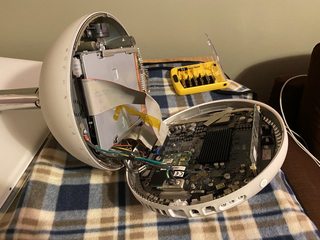
Cleaning the iMac G4
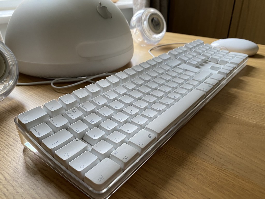
Although the eBay purchase lacked the original box, it did come with the original keyboard, mouse and Harman Kardon speakers. The iMac itself was in great condition, with hardly any yellowing of the plastics, and only needed a slight clean with alcohol, and some polishing of the chrome display arm.
The speakers are mostly transparent acrylic spheres, with the speaker cone exposed on the front. Some of the rubber and plastic of the speaker cone had yellowed, so needed a bit of cleaning with alcohol, which was quite effective. I think to fully restore these I’d need to maybe look at the Retrobrite process, but they look pretty good for now.
The mouse also needed some light cleaning with alcohol, especially the cable which was a bit dirty.
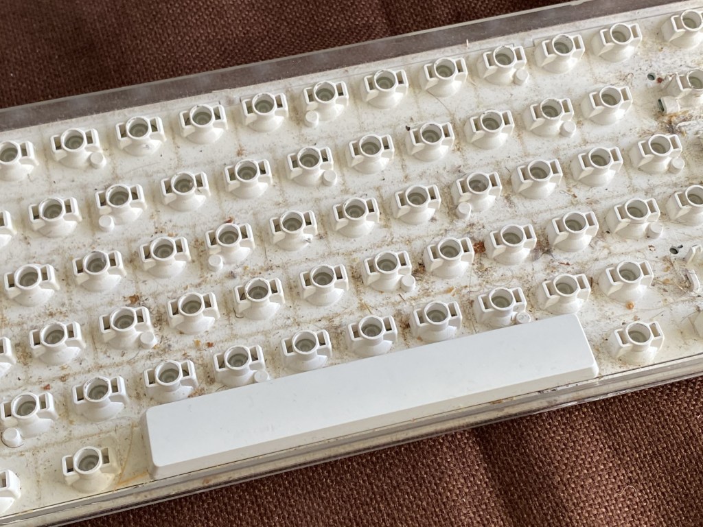
Now we come to the keyboard. Compared to its modern counterpart, the Apple keyboard of this era is enormous. Sitting on your desk, the farthest edge sits 4cm high and curves down to the closest edge at 2cm high. For comparison, the tallest point on the modern keyboard is 1.8cm, sloping down to a mere 0.8cm.
The entire keyboard is mounted on a curved white plastic base, which sits within a flat transparent plastic tray, so that the keys appear to ‘float’. Sadly this transparent base means that every crumb from every sandwich eaten in the vicinity of the keyboard through its life, was also on display for all to see. It was pretty gross.
Thankfully, these keyboards are fairly easy to disassemble, with three Torx T5 screws underneath, and a few Phillips-head screws inside. Undoing those allows you to get into the case, and fully clean everything inside.
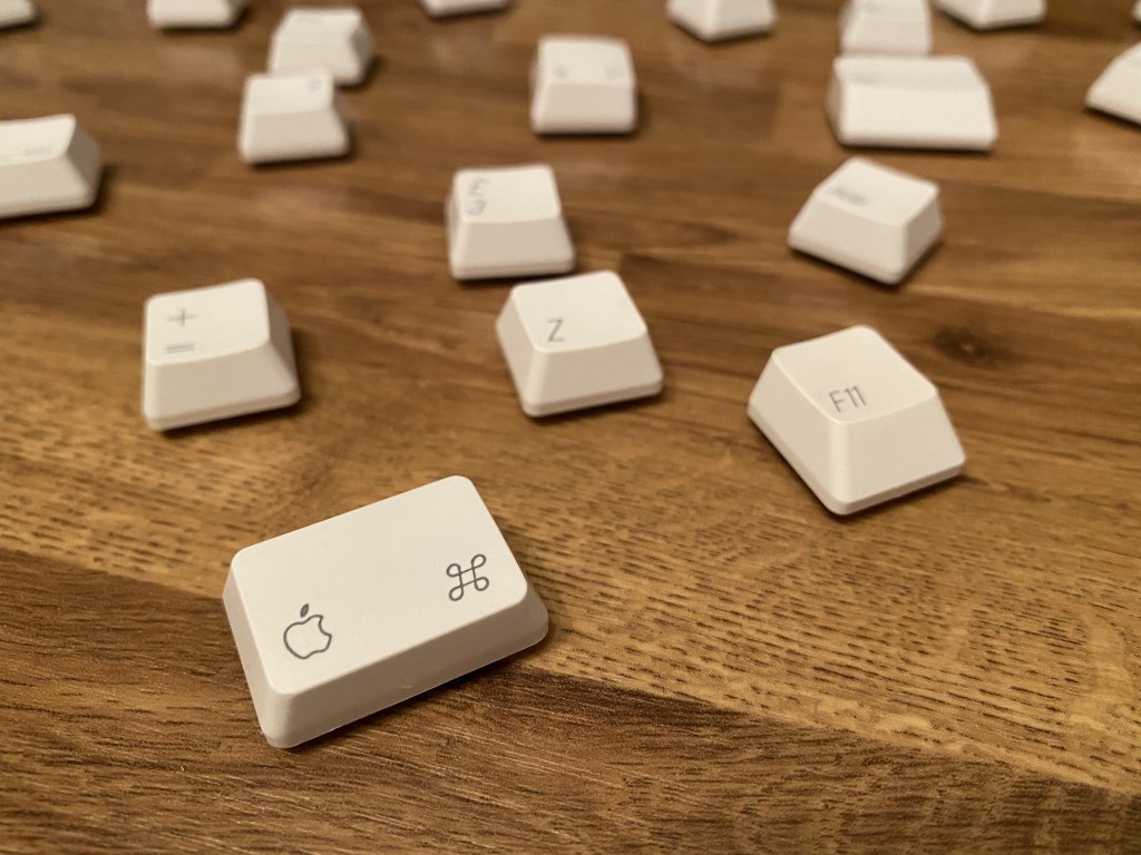
What’s more, the key caps easily pop off without damaging anything, so you can properly clean underneath them. Some of the wider or taller keys have little metal clips that help stabilise them, but these can be slid out carefully when popping the key. I then washed each key in the sink, using washing up liquid, and allowed them to air dry overnight.
Repairs
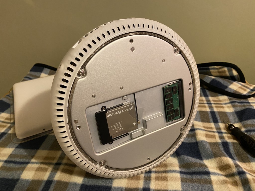
As I said earlier, this Mac was in pretty good condition, however I did notice one thing wrong after booting it: the clock would not remember the correct date and time. This problem usually occurs on older Macs when the PRAM battery has failed. PRAM or “Parameter RAM” is a type of memory used to save system settings when the computer is unplugged, including display settings, speaker volume, startup volume and of course the system clock.
When this battery fails, the PRAM is effectively reset when the computer is not powered. Unfortunately, given how long these batteries last, they aren’t designed to be easy to access. This makes it painful when they do need replacing.
I won’t repeat the exact steps here, but I can recommend iFixit’s iMac G4 guide. They also have the original service manual should you need to do something else like replace the hard drive.
Separating the base from the dome was very difficult. Even without the screws holding it in place, it just didn’t want to budge, and I was afraid to apply too much pressure in case I broke something off. Eventually, carefully prising the two pieces apart, I was able to get enough leverage to separate them.
The dome of the iMac G4 is absolutely packed, there’s not a single bit of wasted space, it’s pretty incredible. The dome houses a full size hard drive and full size SuperDrive, stacked on top of each other. I would say that the ultimate size of the dome was determined by the size of those components; the dome is as small as it could possibly be to allow those components to fit.
The logic board sits in the bottom piece, with a non user-upgradeable full size RAM stick. Given there’s a user-upgradeable half size on the outside of the base (under a chrome panel), I’m not sure why they opted for the larger one internally, especially with space a premium.
Noticeably, there is no cooling on the CPU itself, but there are heat pipes which connect to the dome’s chassis, and transfer heat to the top of the dome where a cooling fan sits, atop the disk drives. This means that any time you open the iMac, you need to clean these contacts and re-apply thermal paste to prevent it overheating.
I used the following:
Saft LS 14250 ½AA 3.6V PRAM battery I couldn’t find a definitive source on which battery Apple originally used, and not wanting to crack the machine open until I had a new battery to put in, I picked the most suitable looking. I was pleasantly surprised to find it was the same make!
Re-assembly was also a bit tricky, as the heat pipes had moved slightly, and so I couldn’t properly re-insert the screws. I had to insert the screws with the case still open, so I could guide them through properly.
Overall, making repairs to this machine is a pain.
Software
The machine originally shipped with Mac OS X 10.2 “Jaguar”, but the model I have can run up to 10.5 “Leopard”, and luckily enough I still had my original Leopard install disc. I opted to wipe the machine and go through the install process, which took me back to my first job in tech support.
During the first boot, Macs of that era would show an introduction video and then take you through initial setup. I’d actually forgotten they used to do this, so it was quite nostalgic to see Leopard’s again.
I still had the installers and license keys for all the old Mac software I’d bought over the years, and was happy to see they all worked with no issues. For example, loading up my trusty text editors SubEthaEdit 2 or TextWrangler took me back in time to 2002, where I was using them to edit PHP websites.
One other thing that is immediately noticeable is how “quiet” the OS is. It has no notifications bar. No iMessage integration. Nothing to disturb you. It feels like it’s actually doing very little in the background, and that’s because it is! It’s actually a pleasant difference, and one that I wasn’t expecting. Notification fatigue is real.
I wanted to write this blog post using the iMac, so I needed one more thing, namely Git so I could clone the blog repository, and make commits to it directly from the iMac. Usually I’d install Homebrew and then Git, but this being an unsupported architecture I had to use a different approach.
Luckily there is a fork of Homebrew called Tigerbrew which maintains support for PowerPC Macs running 10.4 “Tiger” or 10.5 “Leopard”. You need the Command Line Tools which I had on my original discs too.
I was then able to generate an SSH key locally (which took 10-15 minutes, a stark difference), clone the repository and open it in TextWrangler (which handles Markdown better than SubEthaEdit).
Writing this blog post on the iMac G4 itself, using TextWrangler.
There are a lot of resources for old PowerPC Mac software out there, being maintained by people who are passionate about these older systems, such as Macintosh Garden.
The Internet
This model has an AirPort card, which allows the computer to connect to the Internet wirelessly. It’s huge, the same size as a PC Card, and it slots into the bottom of the computer.
I was able to connect to my home wifi, and remarkably, Mac OS X told me there were Software Updates available. I wasn’t expecting Apple’s servers to even be listening for update requests from an 18 year old computer, let alone providing some.
How useable is this computer on the Internet today though? To be honest, it’s mixed. Safari 5 is bundled with Leopard, but sadly this browser is far too old to work with most websites. Since TLS 1.0/1.1 was deprecated most sites have moved on to TLS 1.2 for encryption, which leaves Safari 5 out in the cold.
Thankfully, the helpful folk over at TenFourFox are actively maintaining a fork of the open source Firefox browser, modified to work on Macs with PowerPC G3, G4 or G5 chips!
Viewing this blog from the iMac G4 over Wi-Fi, thanks to TenFourFox.
Once you have that installed you can actually get pretty far on the World Wide Web. Sites (like this blog) that aren’t loaded with heavy JavaScript trackers run really well, but other sites were quite slow.
Some sites such as YouTube were essentially unuseable. This isn’t too surprising considering the age of the iMac and the resolution of modern YouTube videos. But I was surprised how much mileage I could get out of such an old computer.
Verdict
Well, this turned into a bit of a longer post than I thought, but there was a lot to cover. It was quite a trip down memory lane going through the installation and setup, and revisiting this older era of computing that helped me get my career in IT started.
I’ve seen others documenting attempts to retrofit the iMac G4 with a more modern Mac, for example fitting a Mac Mini inside the dome. Perhaps one day I’ll give something like that a try, but it would be a shame to break an otherwise functioning bit of computing history.
I have to say overall I still think this is a brilliant little computer, and I suspect I will always have a soft spot for it’s unique design.
Hot on the heels of their iPhone announcement, Apple has returned with a special event all about the future of the Mac.
Back in June, Apple announced they were migrating the Mac away from Intel processors to their own custom silicon. Though their A-series chips have long provided iPhones with industry-leading performance, until yesterday’s event we weren’t sure how this would translate to the Mac.
This is the Apple M1.
Let’s start with the specs; Apple’s M1 uses a 5nm process, packing 16 billion transistors, 4 high-performance cores, 4 high-efficiency cores, an 8 core GPU and the RAM, all in one compact System on a Chip (SoC) design.
We’ll have to wait for real benchmarks to compare, but Apple claims that the high-performance cores are the “world’s fastest CPU core” when it comes to “low-power silicon”.
Then there are the high-efficiency cores which offer similar performance to the current MacBook Air with Intel, but use 1/10th of the power. That’s a pretty huge improvement. Lower power usage means lower heat generated, which allows Apple to forgo the fan in one of the new models, so it runs silently!
In fact, the entire SoC offers three times the “performance per watt” as the outgoing models, meaning these new Macs can do far more with far less juice. Hopefully this means they’ll run quieter and cooler, but we’ll need to try them out with real workloads to find out.
New Macs
The first new product announced was the MacBook Air. It shares the same physical design as its predecessor, but offers 3.5X faster CPU performance, 5X faster graphics, 2X faster SSD and a huge 18 hours of battery life. All with a silent design.
There was also a rather substantial update to the Mac Mini, with 3X faster CPU and 6X faster graphics, allowing the tiniest Mac to drive an enormous 6K monitor. That’s a lot of pixels to push around for such a compact computer, and a great way for an existing PC owner to switch to the Mac ecosystem, whilst retaining their existing display and other peripherals.
Finally, the 13″ MacBook Pro was updated, with 2.8X faster CPU, 5X faster graphics and 20 hours of battery life.
Transition
I’ve been through a processor transition myself back when Apple switched from PowerPC to Intel, so I’m familiar with how challenging this is. Last time around they introduced Universal Binaries which contain architecture-specific code for both platforms, so that developers could still distribute a single binary to their customers.
Apple has gone for this approach again, which keeps things simpler for end-users, but it does have a downside. Universal Binaries contain two sets of the same code, one compiled for Intel and one for Apple Silicon, making them larger in size.
I remember back with the PowerPC migration there were tools that would strip the code that didn’t apply to your Mac, to save disk space. I think people tend to have more storage space these days, but maybe we’ll see similar tools this time around.
I think this approach works well because end-users don’t have to think about anything, “it just works”. But what if a developer doesn’t update their app right away? Well another technology from the last migration is back, called Rosetta. Rosetta is an emulation layer built into the OS, which seamlessly runs Intel-specific code, converting it to ARM-specific instructions on the fly.
The trade-off is the app can’t run at full speed when emulated. Is this a problem? Apple doesn’t think so. They claim Rosetta is so fast some apps performed better being emulated on Apple Silicon than they did running natively on Intel. That’s pretty crazy to think about.
During the last transition I remember using Microsoft Office on my Intel Mac, which was compiled for PowerPC. You could tell it wasn’t as fast as the native apps, but it wasn’t a big deal at all. In fact I wrote my University dissertation this way thanks to Rosetta.
One possible sticking point for developers might be Docker, which supports containerisation on macOS via a built-in Linux virtual machine. Although Docker can update their code to support the new native virtualisation APIs of macOS, the Docker images themselves are still architecture-specific. I’m not really sure how they’re going to tackle this issue, but it might be enough to make developers hold off upgrading for now.
Intel’s woes
These are already some pretty impressive looking specs; what Apple’s silicon team has managed to do in just a few years is simply incredible. Remember too that this is just the start. We’ve still to see what they have in mind for the higher end systems, such as the 15″ MacBook Pro, the iMac Pro, and the Mac Pro.
It’s interesting that in just a few short years Intel has managed to lose their technology lead. They now face strong competition from AMD, who recently knocked it out of the park with their Zen 3 architecture. They’ve also lost Apple as a customer for both CPUs and GPUs, whose strong opening here proves they were right to go their own way.
Intel now needs to play a lot of catch-up, but earlier this year the company announced they were delaying their 7nm process by a further six months to 2022. AMD projects they will be releasing their 5nm chips by the end of 2022, so will Intel be too late?
What’s next?
With such a great start, I’m excited to see what the remaining Mac models might look like with Apple Silicon inside. I’m also curious if we’re going to see any other technologies make it in to the Mac, such as Face ID or ProMotion displays, both notably missing from any Mac in the lineup.
Hopefully Apple won’t keep us waiting too long to find out.
With Apple’s recent announcement of new iPhones I thought it would be useful to put together a little post about the new hardware sizes and how they compare to various other models.
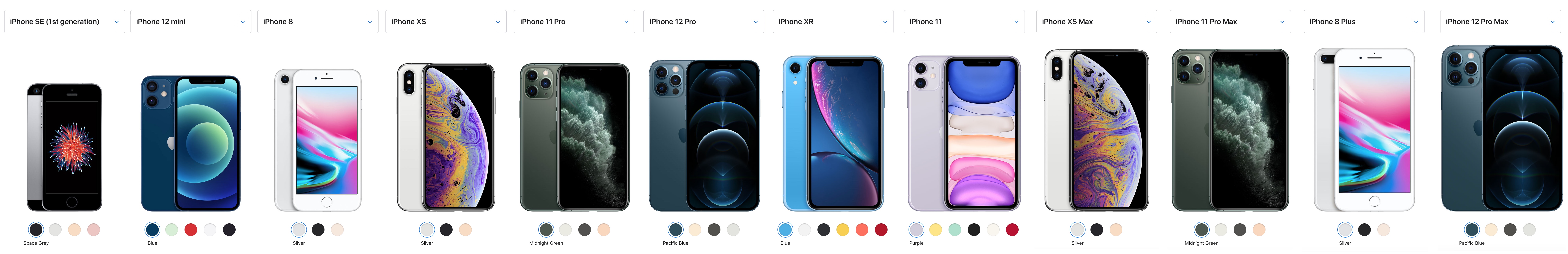
Apple provides a very useful iPhone comparison tool but it only lets you choose three phones at a time. To make comparison easier I made a composite image from multiple iPhone models, starting with the iPhone SE and going up to the current phones just announced.
Observations
The iPhone is now available in a multitude of different sizes, and they haven’t always tallied with the price, for example the cheaper 11 is physically larger than the more expensive 11 Pro. The picture gets messier when you consider that Apple continues to sell the SE (2nd generation), 11, and XR on top of the four new models introduced last week; that’s quite a variety.
This year’s model lineup seems more sensible though, starting with the 12 Mini as the smallest, you then have the 12 and 12 Pro which are the same physical size, and finally you have the 12 Pro Max which is the biggest. The 12 Pro mainly differentiates itself from the 12 with an upgraded triple-lens camera system and a stainless steel finish on the sides. The 12 Pro Max offers more unique camera upgrades, and is the only model that has the sensor-shift stabilisation technology, the wider ƒ/1.6 aperture lens (47% bigger) and 1.7μm pixels, Apple claims this delivers an 87% boost in low-light performance.
The previous 11 Pro and 11 Pro Max models had no differences in their camera systems, so you weren’t forced to get the largest physical model to get the best camera. This is disappointing for someone like myself who prefers a smaller phone, but also does a lot of photography and so wants the best camera.
The smallest
The iPhone 12 Mini really is tiny! It’s almost as small as my previous phone, the original iPhone SE, which I stubbornly ran for multiple years until its age forced me to finally upgrade. Note that it’s also smaller than the iPhone 6/7/8 body, which is the same size as the second-generation SE. I can’t wait to try one out in person and see if my small phone dreams can be realised again, without compromising on the latest technology.
This new model seems like the perfect upgrade for anyone who has been holding out for a small iPhone, and since it’s packing the same internals as its larger siblings, the only real trade off is the smaller battery that comes with the smaller dimensions.
Other sizes
The 12 Pro is actually slightly larger than the 11 Pro it replaces, whereas conversely the regular 12 is slightly smaller than the regular 11 it replaces.
When we take a look within the same generation, the 12 and 12 Pro are the same size, but interestingly the 11 was actually larger than the 11 Pro.
The largest
Until last week the iPhone 8 Plus was the biggest iPhone ever made, being ever so slightly larger than the 11 Pro Max – but no more; the iPhone 12 Pro Max now firmly takes the crown as the largest iPhone available.
Apple started their annual World Wide Developer Conference yesterday and for the first time it was delivered virtually, and free for all developers. The conference continues throughout the week and will be running over 100 live sessions with Apple engineers.
As always the event kicked off with a keynote address showing the major changes to each platform.
Apple launched a new Apple Developer app which is pretty good and contains all the video sessions from the current and past WWDCs going back to 2016.
Apple Silicon
The biggest change is the announcement that Apple will be switching from Intel processors to their own custom designed ARM chips over the next couple of years. As the performance of their A-series chips has improved in successive iPhones and iPads, I’ve wondered at what point Apple would consider putting them in a Mac.
We’ve been in this situation before. Back when Apple used PowerPC chips, they had become increasingly frustrated with the architecture. The most powerful G5 chip was to be found only in desktop models, Apple just hadn’t been able to shoehorn it into their notebooks, despite years of trying; the chip was just too big and power hungry to work within the thermal envelope of a portable.
Steve Jobs put it best when he said:
“As we look ahead, we can envision some amazing products we want to build for you, and we don’t know how to build them with the current PowerPC roadmap.”
– Steve Jobs, WWDC Keynote 2005
ddddd
He spoke of “performance per watt” as a unit, and looking at the PowerPC roadmap projected out 12 months, they were going to get 15 “units of performance per watt”, whereas Intel’s roadmap was going to deliver 70.
I think Apple have found themselves in this situation again. Intel’s move toward 7nm manufacturing isn’t going that well, and they admit that their 10nm process is doing quite poorly after years of delays. Intel seems unable to deliver the chips Apple wants in order to build their next generation products.
This time Apple doesn’t need to look externally to find a solution as they’ve been shipping their own silicon for more than ten years already. Since 2010 with the A4 chip in the original iPad, Apple claim to have delivered over two billion custom SoCs in the last two years alone, and improved GPU performance by 1000X since the original iPad. That’s pretty amazing.
Using their own silicon in a Mac will also allow them to bring some of the specialised circuits they’ve already been adding to iOS devices, such as the Neural Engine for Machine Learning, or dedicated image signal processors for things like computational photography.
I’m looking forward to see where this can take the Mac.
Privacy
Apple got a lot of mileage out of their privacy stance. It’s good to see them putting extra effort in to explain what the difference is between their approach and mainstream tech, helping users see why it’s better.
They didn’t just mention it as each new feature was revealed, they had an entire section dedicated to their position that privacy is a “fundamental human right” and their key principles to achieving it, which were:
Data minimisation – avoid collecting any data in the first place if you can
On-device intelligence – avoid sending data to the cloud wherever possible
Security protections – stops malicious attempts to access data
Transparency and control – puts users in the driving seat
In a time where mass surveillance and data gathering, the likes of which George Orwellcouldn’t even imagine, is so prevalent, I think it’s admirable that Apple is one of the few in “big tech” that is putting their money where their mouth is to defend privacy.
On iPhone, the inclusion of activity lights for the camera and microphone, showing up to the right of the notch, is a nice touch too.
On the web, Apple have been driving privacy forward for years now in Safari, with Intelligent Tracking Prevention identifying and blocking trackers from profiling your browsing activity. The latest update adds a new Privacy Report showing which trackers are being blocked, and how often they’re cropping up in your browsing sessions. It’ll also alert you if a password you’re using on a website has been compromised, and gives you fine-grained control over which browser extensions can run on which websites.
iOS 14
The biggest change for iOS must be the new home screen design. It’s never really made that much sense to me that the widgets were relegated to an almost hidden screen to the left of home. I’ve always quite liked the Metro UI on Windows Phone, and these new widgets remind me of that, but with a nicer design and more flexibility. The “Smart Stack” widget looks like it will be quite useful, showing multiple widgets in a stack, and automatically showing the most relevant at the top. It’s worth noting that these new features are not mandatory, users can keep all their home screens the way they are right now if they like.
The new “App Library” is a nice take on an old Android feature for listing all apps, I think it’s a better implementation though as it groups each app by its category, with the top two slots being reserved for “Siri Suggestions” and “Recently Added”.
The changes to iMessage are welcome too. Features like “mentions” and “threads” already exist in many other chat apps, so iMessage is playing a bit of catch-up here, but again we shouldn’t forget the privacy benefits.
The improvements to Maps (especially navigation) looked quite nice, but they tend to be quite US-centric, rolling out to other countries quite slowly. For example their take on Google’s Street View, named “Look Around”, is still US-only. Again though, privacy is at the forefront with Apple claiming (emphasis mine):
“Maps is the best way to navigate and explore the world, all while protecting your privacy.”
Here’s hoping they can speed up the rollout of these features worldwide so everyone can benefit.
iPad OS
iPadOS is growing up again. A lot of the features were “quality of life” improvements, bringing parity with the Mac, things like proper sidebars with drag and drop, full Spotlight search integration and so on.
The standout feature for me was “Scribble” which allows you to use Apple Pencil to convert handwriting to text in any text field on the system. When I was studying at University I invested in a Toshiba Portégé 3500 hybrid laptop/tablet which ran Windows XP Tablet PC Edition. You could use it in a standard notebook configuration, or you could flip the screen around so it closed facing outwards and use it as a tablet with an included stylus.
It allowed you to take handwritten notes, which would be converted to text, mixed with diagrams and so on. This was most definitely a great idea that was way ahead of it’s time. Sadly the technology of the era just wasn’t up to the task, but the concept itself has always appealed to me, and it’s brilliant to see it here again in iPad OS 14. The Portégé was 3.2cm thick and weighed 1800g, compared to the iPad which is only 5.9mm thick and weighs a mere 471g. I would have loved this device back when I was a student. To be able to carry all of my textbooks and take down all my notes, sketches, diagrams all on this single lightweight device would have been incredible.
macOS Big Sur
No longer do Apple fans have to explain to people that the X is pronounced “ten” as this is the first macOS since 2001 that isn’t version 10. There’s quite a big change to the UI, bringing back some of the depth that was missing since the flat design of Yosemite debuted.
There are lots of rounded corners in windows, buttons, menus, and icons, which unifies some of the design language between iOS and macOS, but rather than totally iOS-ify the Mac, Apple seems to recognise and acknowledge that the Mac has its own personality, and they should embrace that rather than extinguish it.
It also made me think that a change in Mac form factor might be around the corner. iPhone and iPad already have displays with rounded corners, perhaps the first Macs to use Apple Silicon will feature rounded displays to match? In Luke Miani’s video review he shares this view but also observes that these big round buttons are “more touch friendly” too, possibly indicating touch screen Macs could be on the way in the future.
The ability to run iPhone apps natively on Apple Silicon will be interesting to see. My concern here is that the current generation of Catalyst applications haven’t been very good so far. Could this lead to a dumbing down of Mac applications? I hope not, but Apple still have a bit of work to do with Catalyst to prove that you can create apps that look and feel like proper Mac apps.
At the same time, I do think the shared architecture will make it easier for developers to build applications that run across all Apple devices, optimising the UI for each device, but without needing to re-engineer the entire backend of the app each time. This is the strategy Microsoft were pushing with Windows 8 and Windows Phone, unfortunately that didn’t work so well, but I have more faith in Apple here to deliver on this.
Interestingly, Apple seems to be reversing course on extensions in Safari, having all but removed them in previous versions, they are embracing them again through a new technology called Safari Web Extensions. This seems very similar to the WebExtensions API that Firefox uses and should allow extension authors to write extensions that work on multiple browsers, with just a few browser-specific changes.
Apple were also keen to highlight the industry leading performance of Safari, claiming the new version is 50% faster than Chrome, plus the extra battery life you’ll get from Safari (1 to 3 hours more depending on the activity) compared to Chrome and Firefox. I’m looking forward to the final benchmarks to confirm this claim, but Safari does have a track record of being much lighter and faster than other browsers.
Everything Else
Since this article is getting quite long, some final thoughts on a variety of things Apple mentioned during the keynote:
Built-in curated Guides for Maps looks nice for people visiting new cities, once the current pandemic is behind us. Things like cycling directions taking elevation, road density and business into account are nice for optimising your cycle route. Maps gains EV charger location support but goes a bit further and can take into account the charger type your vehicle uses, so you don’t end up stuck at a site with the wrong one.
Spatial audio for AirPods Pro looks incredible, automatically switching between multiple devices based on which ones you’re using is a game changer for bluetooth audio, which is otherwise clunky when dealing with multiple devices.
I liked their idea of a “Nutritional Information” table for app privacy covering what data will be collected and what it will be used for so you can see at a glance what to expect. I think this metaphor will help people understand the importance.
The open-sourcing of HomeKit, and the cross-partner Home Automation approach sounds like a great idea, hopefully we’ll see more compatibility across the home automation ecosystem with this, all with a focus on privacy.
Adaptive Lighting is basically “Night Shift” but for your light bulbs – very nice.
Wrapping up
Tim Cook said a couple of times throughout the keynote:
“We haven’t stopped innovating”
I think this is true. Although there wasn’t one big item revealed that blew people away, I think the scale of what they’re trying to do across the board right now – to create a unified platform across desktop, notebook, phone, tablet, watch and television – is very ambitious and exciting. It’s also good to see Apple recognising and trying to address where they’re weaker, for example by finally allowing people to change some default applications on iPhone, and opening up Siri and HomePod to work with more applications.
I for one will be looking forward to seeing what happens next.