Liquid Glass and the end of flat design?

I’ve always been a huge fan of the skeuomorphic design of the earlier iPhones, they seemed so quirky, and full of character. I loved all the little details, like how the reflections on the chrome volume slider would react and shimmer, as if light were really reflecting off as you moved the phone around. Or how the notes app had little torn pieces of paper from previous notes. I even loved the Rich Corinthian Leather™ of the calendar app, complete with the fancy stitching, it felt luxurious, especially on the first high-DPI “Retina” displays.

When iOS7 came along back in 2013 it was quite a departure from what we had become used to, with seemingly all of that personality thrown away. Gone was all the depth, texture, and character, and in its place we had super thin text, an endless sea of white backgrounds with no shadows. It felt almost “clinical”. This “flat design” has dominated the industry ever since, and although Apple did walk back some of the more extreme design choices in later software releases, I still missed some of the quirky and whimsy designs we used to see; apps that felt like they became the thing they were imitating.

There’s a great quote I read in a blog post called “The Death of Design” that captures how I feel about what we lost with the move to flat design:

We designed things just to see what they might look like. A calendar app, a music player, a weather app made of chrome and glass. Were they practical? Not always. But they were fun. And expressive. And strangely personal. We shared them on Dribbble, rebounded each other’s shots, iterated, and played.

I remember spending hours on the tiniest details of an interface element no one had asked for. Just… exploring. Pushing pixels for the sake of it.

So when rumours started circling that Apple was going to be redesigning things this year, I was excited to watch last week’s WWDC 2025 Keynote to see what they had been working on, as they unveiled this new design language for all of their operating systems.

“Liquid Glass” as they are calling it, seems to be a step in the right direction, where the user interface is composed of pieces of glass that reflect the world around them, responding to and reacting with light how it would behave in the real world.

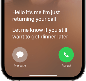
As an example, we can see a button here reflecting the yellow of the control above it, as two objects would do in real life:

There are also some really nice playful elements, for example the way folders open and close as you hover over them, and convey their state with subtle clues in their icons, for example when you place files in an empty folder, the icon changes to show that, with a little bouncy animation. Elements feel quite expressive and organic. Liquid is the perfect term for it. It’s taking what we’ve seen from the Dynamic Island on iOS, and applying it to the whole system.

I’ve seen people referring to this new expressive era of design as “Neumorphism” or “Physicality”, and I can highly recommend reading Sebastiaan de With’s excellent blog post on the topic of Physicality, over at the Lux blog.

After watching the Keynote, I do have a couple of concerns. The first one is around text legibility. In some of the examples they gave, the text was quite hard to read, especially with busy scenes where your content is very visible through the glass UI controls. Some apps feel better than others in this regard, so I’m hoping that will improve during the betas.

The second concern is around information density, which still seems to be under attack. Apple is clearly going all-in on “consistency” across all their platforms, but I worry that we end up losing something in the process. For example, on macOS we now have iOS-style alerts which are narrow, and stack all the buttons vertically. This feels like an odd choice for a desktop OS which is used exclusively with big widescreen displays. Why not play to the strengths of each platform?

Overall though, I’m really excited to see how this all ends up coming together, especially when they’ve finished polishing it for release this autumn, and I can’t wait to try it out for myself.

Visual Voicemail is actually pretty great

Yes, I know. I’m sure some of you will be thinking this is a bit of a random post, as you double-check your calendars to make sure that it is indeed the year 2025. Don’t worry, I’m not going to start talking about fax machines and record players, but I wanted to share some recent experiences with good old Visual Voicemail.

History

I remember my first mobile phone had voicemail, but the process to listen to your messages was a bit tedious. If someone left you voicemail, the network would send you a text to let you know, along with the number that called. As this didn’t link to your address book, you’d have no idea who it was unless you’d memorised all your friends’ phone numbers, so you’d then have to dial the voicemail service to listen to the actual message.

After navigating through the various menus, the caller’s number would be read out slowly, one… number… at… a… time, and finally you’d get to hear the message itself. After struggling to decipher the low quality recording, and assuming you even recognised the voice of the person, you could then return their call. And that’s assuming the message you wanted to hear was the first one in the list. You may have had to listen to several before you got to the one you wanted. Not really the best experience.

When the original iPhone was revealed back in 2007, one of the features they mentioned for the “Phone” app, was Visual Voicemail, which Steve Jobs described as “Random Access Voicemail”, and it worked more like email than the system we were used to. New voicemails would just show up in the inbox for you to listen to, in whichever order you wanted, and you could easily scrub through the audio, then return the call with a single tap if you liked. It even let you record a custom greeting right there in the “Phone” app. The difference was night and day.

There was only one slight complication – this feature required support from the mobile carriers to work; it wasn’t something that could be done entirely on device. Here in the UK the iPhone launched on the O2 network, so they supported Visual Voicemail from day one, but incredibly there are still some networks that don’t support it, even after the iPhone stopped being exclusive to O2.

SIM hopping

For various years I’ve been hopping between networks to take advantage of the best deals, and there’s one thing that I always, ALWAYS notice, and that’s whether the network supports Visual Voicemail. Every time I try a carrier that doesn’t support it, I think maybe I can live with it, maybe the deal is so good it’s worth the trade-off, but every time I try, I’m wrong.

Issues with signal quality are surprisingly common in the UK, so missing a call on a network without Visual Voicemail feels a bit like being thrown back in time. Dialling a clumsy old voicemail service rather than having my messages magically appear as soon as I get better signal, always leaves me pining for this simple little service from the original iPhone.

And it’s not that I’m some sort of celebrity, dealing with hundreds of calls a day! It’s just that the way we communicate with our friends and family has changed. These days we tend to text more than we call, keeping in touch with our loved ones via group chats and photo sharing. But this means if someone does call when I’m out of service, it’s usually for something important that I don’t want to miss.

Taking it to the next level

Since I’ve recently returned to a network that supports Visual Voicemail, there were some new features introduced back in iOS 17 that I had wanted to take for a spin, and I’ve found them to be really useful.

Live Voicemail

This feature is really handy for screening unknown numbers. The way it works is your phone answers the call, but Siri does the talking, asking the caller to leave a message, as if they had reached voicemail. But as the caller is speaking, their words are transcribed in real-time, so you can see on the lock screen what the call is about. You can even decide to pick up if it’s a call you actually want to take.

Transcriptions

The transcriptions captured from Live Voicemail are saved in the Voicemail tab of the Phone app, but what about regular Visual Voicemail? Well iPhone automatically transcribes those as they are delivered from the network, so you’ll get a transcription no matter which method you use. I’ve found it very useful, and the quality seems pretty good, with only occasional mistakes, which are usually self-explanatory based on the rest of the message.

Getting out of the way

Overall, these features work so well together, they make it a breeze to catch up on any calls I miss when I’m out and about, and are a great example of technology helping to make things easier, rather than getting in the way. For me, that is truly technology at its best.

As an aside, I wonder how many younger people today know that the voicemail icon represents an old reel of audio tape? 3D-printed save icon anyone?

Compact macOS menubar icons

When Apple released macOS 11.0 “Big Sur” back in 2020, one of the changes they made was to increase the gap between icons on the menubar. During development the gap was enormous, but it was eventually toned down for release, based on the negative feedback during testing.

People with a lot of menubar apps found the icons took up too much space, so tools like Bartender became popular to help keep things under control. Later when Apple released the first MacBooks with a notch, people even found their icons disappearing underneath it!

So what can we do about that?

The first thing to do is look to see if any icons can be removed, for example with things like battery life and volume being accessible in Control Centre, maybe you don’t want discrete icons for those? You can quickly remove them by holding Command (⌘) and then dragging the icons off the menubar.

Mind the gap

Once you’ve removed any unnecessary icons, you can modify some hidden macOS settings to reduce the gap between each icon, so they don’t take up as much space. Simply open a Terminal window, and run the following commands:

defaults -currentHost write -globalDomain NSStatusItemSpacing -int <integer>
defaults -currentHost write -globalDomain NSStatusItemSelectionPadding -int <integer>

You’ll then need to log out and back in for the changes to take effect.

I found values of 8 and 6 looked best to my eye, but you can experiment with different integer values to find your favourite.

Before and after, it’s subtle but with a busy menubar it can make all the difference. Shout out to iStat Menus for the performance monitoring widgets you see here.

Undo

You can easily restore the default setting at any time with the following commands:

defaults -currentHost delete -globalDomain NSStatusItemSpacing
defaults -currentHost delete -globalDomain NSStatusItemSelectionPadding

Don’t forget to log out and back in again for the changes to take effect.

Enjoy!

Not so smart assistants?

I really like using Siri to get things done when I’m not able to use my phone normally. For example, when cooking I can quickly add things to my shopping list as I’m using them, so I’ll remember to buy more the next time I’m at the supermarket. Or if I’m driving somewhere, I can easily control my music, or reply to a friend to let them know if I’m running late.

When Siri works, it’s brilliant, but there are times it can be incredibly frustrating to use.

On it… still on it…

Every year at WWDC we hear from Apple that Siri can do more and more things entirely on-device without needing the Internet, but in practice it still seems to suffer from connection issues (even when all my other devices are fine). This usually manifests as Siri responding with the phrase:

On it….. still on it….. something went wrong!

As soon as Siri answers any request with “on it…” I know with 100% certainty that the request is going to fail. Even worse, if you immediately ask Siri to do the same thing again, it will then typically succeed! I really wish Siri would just retry the request itself silently, and save me from hearing that dreaded phrase again.

Split personality

I have a couple of HomePod minis (or is it HomePods mini?), one in the living room and one in the kitchen. When cooking it’s handy to set various timers, so obviously I ask Siri to do that, but if I go into the living room, and ask Siri to check on the status of the timer, it acts like it has no idea what I’m talking about.

Me: “Siri, how long’s left on the timer?”
Siri: “There are no timers on HomePod.”
Me: *sigh* “Siri, how long’s left on the kitchen timer?”
Siri: “There are no timers on HomePod.”
Me: *SIGH* *walks to Kitchen* “Siri, how long’s left on the timer?”
Siri: “There’s a timer with 4 minutes left.”
Me: (╯°□°)╯︵ ┻━┻

I found something on the web

I’ve also had interactions where Siri gives me an example of some phrases I can use, only for it to turn around and say it has no idea what I’m talking about when I try to use them. Or it just abandons any attempt at understanding you and does a web search for what you asked. This usually isn’t very helpful, and it’s completely pointless on HomePod, given it lacks a display. Siri will chastise you in that case, and tell you to “ask again from your iPhone”.

When it comes to memory, sometimes it will forget what you were talking about mere seconds earlier, forcing you to repeat your request in full, trying to get the syntax correct. It’s like typing into a command line, rather than having a conversation.

By comparison, when this does work it feels so much more natural. Asking about the weather, then following that up with “and what about tomorrow?” flows quite nicely. It can also be quite clever, for example, if you’re asking about “tomorrow”, but the time is after midnight, it will check if you actually meant today, which is probably what most people would mean in that case.

SiriGPT?

Can an LLM like ChatGPT help here? I’ve seen a few articles this week claiming that’s exactly what Apple is working on for iOS 18, and I think it would make a big difference. ChatGPT is already so far ahead of Siri simply in terms of how natural sounding the conversations with it can be. They can be quite convincingly real.

I think it would substantially improve the experience if Apple could integrate those conversational features into Siri, but they will need to be very careful to handle the fact that LLMs hallucinate a lot, which is to say they can generate output that sounds plausible, but is either factually incorrect or totally unrelated.

Although Apple hasn’t jumped on the current AI bandwagon yet, they’ve actually been using machine learning (ML) technology in their products for a while now. They tend to use ML in more subtle ways, such as separating a subject from the background allowing portrait mode to be applied to your photographs, or in real-time during video calls. It also powers the Visual Look Up feature that helps you identify people, animals, plants, and more. There are tons of little features like that throughout Apple’s operating systems that rely on ML behind the scenes.

The good news is Apple’s privacy focus, and the presence of the Neural Engine in all their CPUs, means they are able to run a lot of the ML models entirely on-device. I’d expect no less from a next-generation Siri, and for a smart assistant with so much access to your personal data, this can only be a good thing.

The Sum of its Parts

I recently started a new job, and one of the upsides is that my computer isn’t locked down into oblivion, so I can actually use a lot of the features that make the Apple ecosystem so great to begin with!

Universal Clipboard now works properly, so setting up things like my HR profile was as easy as copying the image I wanted from my phone, then pasting it on the new Mac. It made the setup process so much faster and smoother.

Reminders sync properly so I can create a “Work” list, and add things to that list as they pop into my head. Or quickly add a personal reminder if something comes up during the work day. The old way involved me sending an email to myself, either at my work address, or my personal address, depending on the subject. Then I’d “process” it the next time I was on whichever device had the relevant mailbox configured. Yeah I know 🙈

I can now make use of separate profiles in Safari, to keep personal stuff and work stuff in their own sandboxes, but if there’s something like a bookmark I need, which is in another profile, I can easily find it without much friction. A useful tip here is that you can configure Safari to always open specific websites in certain profiles. I use that to make sure any YouTube links I click on open in my Personal profile, where I am subscribed to YouTube (who wants to see that many ads?!).

It also allows me to bring my collection of useful apps along with me, without needing to buy them all again every time I change jobs, as well as benefit from any subscriptions I have.

Being able to use my messaging apps again means I’m not stopping throughout the day to get my phone out and respond to friends and family. I can quickly respond on the Mac when needed, and then continue with my work without losing my momentum.

Finally, I can access my music streaming without having to fiddle with my phone. It can be a hassle to switch audio between my Mac for calls and then back to my phone for music, now it’s all in one place and much simpler.

Overall, I used to face all these little points of friction throughout my day, but now they’re gone. It made me think of the old saying:

The whole is greater than the sum of its parts.

Those individual elements aren’t revolutionary on their own, but when they work together smoothly across all my devices like this, it really feels like the technology is serving me, not the other way around.

Lakewood City Cinematic

As the release of Cities Skylines 2 draws near, I wanted to give my old city a proper send off, with this cinematic made in the style of a drone video.

Lakewood City I’ve been working on for a few years now, adding a park here, a train station there, and slowly growing it to the size you see in the video. I had started some other cities, but in between breaks from the game I’d always find my way back here, as the first city I started in the original Cities Skylines.

Enjoy!

Back to WordPress

The more astute readers out there will have noticed that there’s been a slight design change around here. I’ve actually just finished migrating from Hugo to WordPress. But why? When I first resurrected this blog, I wrote a post about my reasons for selecting a static site generator (Jekyll then Hugo) in the first place. So what went wrong?

Well to be honest, although the setup was working really well most of the time, there were a few situations where I found it lacking.

Drafts

I was finding the process of writing a draft post a bit “fiddly”. Because every commit to the blog’s Git repository is deployed automatically, I couldn’t commit any unfinished writing without first remembering to set some special flags at the top of the post, in the front matter. Those flags would need to mark the post as a draft, tell the system not to render the page, and not to add it to the posts list and RSS feed. Occasionally I would forget those steps and accidentally “publish” a half-finished mess. It was a bit frustrating.

Image galleries

Dealing with images was also painful. You’d need to deal with naming them, putting them in the right subfolder, and then adding them to the document using a shortcode. I ended up writing some custom code to make creating a gallery of images easier, as I was finding myself making use of the feature quite often, but it was still quite painful to deal with.

Writing on the go

The static site generator approach required me to have a way of writing Markdown and then committing it to a Git repository, then finally pushing the changes up to GitHub. There were plenty of times where I’d be waiting for an appointment, or going somewhere on public transport, where I could’ve done some writing, but this process doesn’t lend itself well to a smartphone environment. It just wasn’t feasible.

I tried to get a workflow going using a really nice Markdown editor called iA Writer, which is a great bit of software, but I was still left with the problem of how to manage the Git side of things. Writing the posts was one thing, but getting them published via my Git workflow just wasn’t a great experience on the go.

Looking at alternatives

If something isn’t working right, try something different. There’s really no need to settle. I decided to look into my options.

I started with some research of various approaches. I wanted something flexible, but not complicated. I wanted something that had a nice editing experience, and good performance. I had also decided that my days of self-hosting were over, so I wanted something that provided a fully hosted version, so I could forget about managing anything, and just focus on writing.

I looked at what some of my friends were using. Things like Medium, or Substack seemed to have a slightly different aim, and I wasn’t sure about some of their policies. Eventually I found myself right back at WordPress. Many years had past since I last used this software, and I was pleasantly surprised to see how it had evolved, so I decided to take it for a whirl.

Gutenberg

The star of the latest version of WordPress has to be the new Gutenberg editor. This new way of creating your posts and pages relies on a range of different components called “blocks”, which you can move around the page as required, and it really gives you a huge amount of flexibility. There is an interactive demo of Gutenberg which you can explore for yourself to see what I mean.

Some of the block types Gutenberg has to offer

Themes that support this type of editor are pretty customisable too, offering predefined areas on the page for you to edit, such as footer, sidebar, and header areas, giving you a remarkable amount of flexibility without needing to do any coding at all. You can also create reusable templates of common blocks to avoid having to edit them in multiple different places.

Initially I did find it a bit daunting, but I stuck at it, trying the various pieces out, and in the end I found that I quite liked it. I decided to bite the bullet and started the process of moving back to WordPress.

Migrating

I decided to migrate my previous posts manually rather than using a tool. This gave me the opportunity to re-work some of the posts I was less happy with, and after all we were only talking about a dozen posts, so I knew it wouldn’t take too long. This also gave me the chance to check the formatting, make sure hyperlinks worked, and to take advantage of the Gallery block to upload the full sized versions of any images I had used.

Migration was straightforward because in most cases I was able to copy and paste from the existing site into Gutenberg, and it correctly interpreted everything, including subheadings, code blocks, and even things like pull quotes; they were all converted correctly into the equivalent block type.

Finally, I decided I didn’t want to have to deal with comments on the posts, so I turned off the entire commenting feature. I figured people can always reach me on Mastodon to discuss things, and having to deal with the inevitable spam here didn’t appeal.

I checked everything looked good, checked the RSS feed was working properly, and hit the button to go live. The rest, as they say, is history.

I’m pretty happy with how it’s turned out, and I’m hoping this will encourage me to post more as well.

Here’s hoping!

Switching from Docker Desktop to Colima

I use Docker containers to automate the setup of development environments in a standard and repeatable way. It makes it very easy to spin up applications locally during development, and especially to ensure everyone working in a team has a consistent environment.

The Docker Engine is actually built on top of a few Linux technologies, including Kernel namespaces and control groups (cgroups), and various filesystem layers. They work together to isolate what’s in the container from your computer, whilst sharing the common pieces, to avoid duplication.

But the Mac does not use the Linux kernel, it uses the Darwin hybrid kernel. So how can we run technology built for Linux on a different Kernel?

Virtualisation

The answer is virtualisation, where we create a virtual version of our computer at the hardware level, but run a different operating system inside it, in this case Linux!

When you install Docker Desktop on a Mac, this is exactly what is happening behind the scenes:

  • A Linux virtual machine (VM) is created behind the scenes, and the Docker Engine is installed inside it.
  • Docker command line tools are installed onto your Mac, and configured to talk to the Docker Engine inside the Linux VM.

In this way, Docker Desktop provides a turnkey solution for running Docker on a Mac.

Older versions of Docker Desktop used a technology called HyperKit to manage the VM, but have more recently transitioned to Apple’s Virtualization Framework which provides greater performance, thanks to support for the Virtual I/O Device specification.

Colima

Recent licensing changes made it quite a bit more expensive for businesses to use Docker Desktop, but there are free and open source alternatives.

Colima is a free and open source project which handles running Docker Engine inside a lightweight Alpine Linux virtual machine. It is a little more work to get started, but once you’re up and running it acts like a drop-in replacement, compatible with all the same Docker commands you are used to.

Image from the Docker Blog.

Installing

You will need to make sure you have Homebrew installed first. Next, quit Docker Desktop, then run the following commands:

# Install Colima and the Docker command line tools:
brew install colima docker docker-compose docker-buildx

# Enable the Compose and BuildKit plugins:
mkdir -p ~/.docker/cli-plugins
ln -sfn $(brew --prefix)/opt/docker-compose/bin/docker-compose ~/.docker/cli-plugins/docker-compose
ln -sfn $(brew --prefix)/opt/docker-buildx/bin/docker-buildx ~/.docker/cli-plugins/docker-buildx

# Add the following to your zsh/bash profile, so Docker can find Colima:
# (don't forget to reload your shell)
export DOCKER_HOST="unix://${HOME}/.colima/default/docker.sock"

Now you’re ready to create the virtual machine where the Docker Engine will run, using the correct command for your version of macOS:

  • macOS 13 “Ventura” – uses macOS Virtualisation Framework with Virtiofs for the best possible performance:$ colima start --vm-type vz --mount-type virtiofs
  • macOS 12 “Monterey” or older – uses QEMU with SSHFS$ colima start

Colima will use 2 vCPUs and 2GB RAM by default, but if you run a lot of containers at once, you may need to adjust that. For example, to double the resources, add --cpu 4 --memory 4 to the colima start command you used above.

You can now verify everything is running properly:

$ colima status
INFO[0000] colima is running using macOS Virtualization.Framework
INFO[0000] arch: aarch64
INFO[0000] runtime: docker
INFO[0000] mountType: virtiofs
INFO[0000] socket: unix:///Users/ryan/.colima/default/docker.sock

$ docker system info | grep Operating
  Operating System: Alpine Linux v3.16   # if it says Docker Desktop here then something is wrong

You should now be able to use docker and docker compose commands normally, they should all Just Work™ transparently.

When you next reboot your Mac, you will need to remember to run colima start to bring the virtual machine back up, before you can use Docker again.

Importing your existing data?

Now that you have Colima up and running, you’ll have noticed that things look pretty sparse. This is because all the existing container images and volumes are still within Docker Desktop’s managed VM.

If this data is important to you, Docker provides a way to backup and restore containers, and also a way to migrate data volumes.

I decided to skip this step as my own use of Docker is for local development. Any data I have in Docker is regenerated automatically when I run my projects.

Cleanup

Assuming you got this far and you’re happy with Colima, you will probably want to send your old Docker environment to the Trash, otherwise the containers and volumes will stick around consuming valuable disk space.

You can use the following commands to tidy everything up:

# Remove old Docker data:
rm -rf /Users/${USER}/Library/Containers/com.docker.docker

# Remove the old Docker Desktop application:
# Note: If you installed it via Homebrew as a Cask,
# run `brew remove --cask docker` instead.
rm -rf /Applications/Docker.app

# Remove the old Docker configuration files:
sudo rm -rf /usr/local/lib/docker
rm -rf ~/.docker

Enjoy!

Switching to Starship

A long time ago, I started experimenting with customising my Bash shell prompt. Rather than just showing the current working directory, I wanted to add snippets of useful information to my prompt. I started with displaying the currently active branch of a Git repository. Next I added code to show which version of a particular programming language was selected.

I continued making improvements to only show the relevant information at the right time, for example hiding the Git branch if I wasn’t currently in a Git repository. and the same with the language version. This stopped the prompt becoming too large and cumbersome.

Problems Arise

Over the years I added more code to this custom prompt, as new technologies were added to my toolbox, however problems started to show.

This custom prompt code isn’t just executed when you open a new tab, it’s run every time the prompt has to display. So the amount of code you put in there has an impact on how quickly your prompt will display. Over the years, it had become so bloated that it was now taking several seconds to execute, and remember this was happening every time the prompt needed to be displayed.

Let’s just say this Bash script had evolved very … organically … and making changes to it was becoming more difficult. Some of the more “artisanal” parts from the early days had become almost undecipherable.

Refactor

My initial fixes were to go through the oldest parts of the prompt code involved janky functions for setting custom colours, and were needlessly defining variables all over the place. Some other areas were invoking commands in subshells and capturing the output, in order to use it later, when in reality they always returned the same value, and were just wasting cycles.

I ripped all of this out to reduce the amount of code being executed, removing code defining colours I never used, and replacing subshells with constants defined at the top of the script. I also looked into the performance of things like rbenv and pyenv to see if they could be sped up.

Performance got a lot better, but it was still taking around a second or so. Satisfied for the time being, I made a note to look into alternatives in the near future.

Board the Starship

A friend of mine had previously recommended a cross-shell prompt called Starship which is written in Rust, but my initial experiments hadn’t been very successful. Given Rust programs have a reputation for being blazing fast, I thought it was time to see how the project had progressed, and maybe give it another try.

I’m happy to say this time, I was able to get Starship to do everything I wanted.

Install

I followed the official documentation to install Starship via Homebrew:

brew install starship

I did not opt to install their “Nerd Font” as this is only needed if you want to make use of the various icons and logos in your prompt, and I wanted to keep things simple.

Next step was to disable my old custom prompt code, and replace it with this:

export STARSHIP_CONFIG=~/.starship.toml
eval "$(starship init bash)"

Notice I have set a custom configuration file location, this is purely because I already have a system for synchronising my config files between systems, and the default location wasn’t suitable. You can probably skip that step.

Restarting the shell I was greeted with my new super fast prompt!

Configuration

The default prompt configuration tries to cover all the bases, but I found it too verbose, so I took a look at the configuration options.

Firstly, I wanted to limit what was displayed to a few key pieces of information, rather than have every supported option jostling for position. I wanted to have the prompt on a single line, and show only the current working directory, Ruby and Python information, the current Git branch, and finally the prompt character:

# ~/.starship.toml
add_newline = false
format = """
$directory\
$ruby\
$python\
$git_branch\
$character
"""

Next I wanted to customise the sections I had enabled so they didn’t show a symbol, and were all bracketed, so each section would be distinct, yet compact. I started by using the Starship presets and then made my modifications on top, resulting in this extra config:

# ~/.starship.toml
[git_branch]
format = '\[[$symbol$branch]($style)\]'
style = 'bold white'
symbol = ''

[python]
format = '\[[${symbol}${pyenv_prefix}(${version})(\($virtualenv\))]($style)\]'
symbol = ''

[ruby]
format = '\[[$symbol($version)]($style)\]'
symbol = ''

Finally I wanted to make the directory section better match the others, by bracketing it, and making it show the full file path for clarity:

# ~/.starship.toml
[directory]
truncation_length = 0
truncate_to_repo = false
format = '\[[$path]($style)[$read_only]($read_only_style)\]'

You can see all the options for the prompt sections I have used below:

Result

The end result looks exactly the same as my old custom prompt did, which is a testament to the customisability of Starship. The performance difference is striking. Bash now starts almost instantly, and my prompt returns so quickly it’s almost imperceptible.

I’m a big proponent of making time to address seemingly small issues like these. They have a habit of building up over time, until every interaction you’re having with your computer is like drying yourself with sandpaper.

I’m very happy I took another look at Starship, and can finally tick this off my todo list.

Git Commit Etiquette

Clear, meaningful, commit and pull request messages are essential when working on a shared codebase. They serve a couple of important purposes:

  • They help everyone find out later why a particular change was made to the code, by making search results more relevant.
  • They speed up the reviewing process and make it easier for the reviewer to understand the intention behind a change.

What makes a good commit?‌

When writing your commit message, try to consider whether it answers these questions:

  1. Why is this change necessary?
    • Does it add a new feature? Does it fix a bug? Does it improve performance? Why is the change being made?
  2. How does this change address the issue?
    • For small obvious changes this might not be necessary, but for larger changes a high level description of the approach used can be helpful.

Try to keep your commit messages small; no more than a sentence or so. Make sure you focus on answering the “why?” question.

If you need more space to explain your commit, add a message body separated from the summary with a blank line, like so:

Short summary of changes here.

More detailed explanatory text, if necessary. Wrap it to about 72 characters or so,
but you can add as many paragraphs as you need to explain the change properly.

Imagine the first line is like the subject of an email (it's what most Git clients
will show prominently), and the rest of the text is the body of that email.

  * You can even use bullet points like this one.

  * And this one!

If you are finding it difficult to write a commit message in this format, it may mean that your commit represents too many different changes, and should be broken up. This doesn’t mean to say you should be creating a new commit for every insignificant change, that’s not what we’re aiming for here, instead try to create commits that represent groups of changes that are moving you closer to your end goal iteratively.

Continuous Integration and Continuous Deployment (CI/CD)

CI/CD pipeline, as depicted by RedHat

The concept of Continuous Integration can help guide us here. This is the practice of merging developers’ commits into the main branch several times per day.

This concept often goes hand in hand with the practices of Continuous Delivery and Continuous Deployment, meaning your changes are being merged to main, and then automatically deployed to production, several times per day. This gives you a really tight feedback loop, and prevents changes from building up which would otherwise lead to the dreaded big bang release.

In order for this to be successful, we need to make sure our commits contain working changes that can be deployed to production. Also think about what would happen if a deployment needed to be rolled back to a previous commit?

We need to consider all of these things when creating our commits.

Staging Partials

What happens if you’ve made several unrelated changes to the same file, and you aren’t ready to commit some of those changes yet? You can use Patch Mode to stage specific modifications to a file, so you can commit just those changes, instead of needing to commit the entire file and every change.

Many editors support staging partials, for example Visual Studio Code.

Bad Habits

Here are some things to avoid when committing:

Large commits

One extreme I’ve seen is waiting until the end of the day and then doing one big commit with every change from that day. Don’t do this!It results in a huge useless diff of likely unrelated changes. Other contributors working on the repository will find it more difficult to read and understand your work. This also applies to yourself once enough time has passed!Consider making small, regular commits as you go, in groups of related changes, rather than everything at the end in one go.

Per-file commits

On the other side of the spectrum, I’ve also seen people creating one commit for each file that was changed, but when adding a new feature to a project, you’ll often be making changes across several files.Commit all of the changes related to the new feature together, in a single commit. This avoids leaving the project in a broken state if someone pulls a commit that has a half implemented feature in it. It’s also easier for people to review.Of course, if the change did only need to touch a single file, then this is ok.

Lazy commit messages

Avoid any commit message along the lines of changed $filename or misc fixes. These messages are frustrating to encounter, and make it much harder for others to see what is happening in the project. They should be avoided in favour of a concise, meaningful message.We can see that the file was changed, what we want the answer to is “why?”.GitHub’s web-based editor doesn’t exactly help here, as it defaults to Update <filename> as the placeholder text. Make sure you provide a better message before you click that Commit changes button.

Unrelated changes

As we’ve discussed above, you should aim to create one commit per feature. Don’t include unrelated changes in the commit, as it makes it harder for others to reason about the changes being made. This will also make it more difficult for reviewers.

Branches and Merging Strategies

Image generated using machine learning with Stable Bee.

If you’re not pushing directly to main, you’ll be using branches instead. This advice is just as valid for branches, but my recommendation would be to use short-lived feature branches. You want to get the code merged into main as quickly as possible, as the longer a branch remains the more likely you are to have problems merging it, as the code continues to diverge.

GitHub uses the Pull Request approach to merge changes back to the main branch, and offers a number of merging strategies you can use.

Merge commits

Adds all the commits from the branch to the main branch via a merge commit. You can continue adding new commits to the branch if necessary, and merge them later. This is the default behaviour.

Squashing merge commits

Creates one commit containing all of the changes from every commit in your branch. You lose information about when specific changes were originally made and by who.If you continue adding new commits to a branch after squashing and merging, when you attempt to merge the branch again, the previously merged commits will show up in the PR, and you’ll potentially have to deal with conflicts.

Rebase and merge

All commits from the branch are added to the main branch individually without a merge commit, by rewriting the commit history. This is a tricky strategy which can sometimes require manual intervention to resolve conflicts on the command-line rather than via GitHub’s web interface. This would then require a force-push to resolve, which is a dangerous feature, and can result in other contributors work being lost.

Even when you are not using the default strategy the advice in this post still stands, as you’ll still benefit during development of the branch, and also when you open your PR for review. Once merged the PR will continue to be useful as you can view the contents on GitHub and see more clearly what happened and why.

Closing

I hope that this has been a useful exploration of what makes a good commit, and the best practices like CI/CD that they help to support. It should help you to deliver better software by creating concise, well-crafted commits that your team mates will find easier to reason about, and thank you for later.